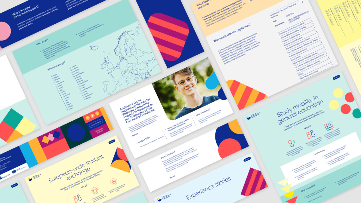
User-friendly website design and development in the public sector

Problem
Erasmus+ was running three different outdated websites in terms of design and technology. They were complex, confusing, and sometimes conflicting. How to consolidate three different web environments into one? How to simplify the understanding of complex processes? How to fully engage different age groups?
Solution
Based on the expectations uncovered in the research phase, we proposed and executed a role-based approach to information architecture in web design and development. We dramatically simplified the interaction required to enroll in the program, saving time for applicants and coordinators.
Results
We helped to build a unified website with straightforward structure and functions. Feedback indicates that customers feel more information is available, while we actually reduced the content volume.
Data
15 in-depth interviews with different segments. 30 different iterative page templates. 6 thorough test sessions. 34% reduced content on the consolidated website.
User research and prototype were carried out in cooperation with AKU Collective. Design by AKU Collective. Brandbook by PauPau.
The new website is a perfect example of how official information from the public sector can be tasteful and user-friendly. The whole process of collaborating with Rethink was as one would dream: every step was carefully considered and executed. As a customer, we felt that every team member cared for the outcomes beyond excellent.
Anni Sahkur
Project Manager
Erasmus+
Erasmus+ is the European Union’s program to support education, training, youth, and sport in Europe. Erasmus+ programme budget for 2021-2027 is €26.2 billion. It supports priorities and activities in the European Education Area, Digital Education Action Plan, and the European Skills Agenda.