Where did the simplicity go?

Most new apps being developed for “old companies” don’t have the goal of adding some desperately needed features (because they are all already there), but making it simpler, more user friendly. Nobody starts out with a thought — let’s make this new app really complex and see what happens.
Even not this guy.

But more often than not we still end up with something like this ticket machine:

How come?
It all starts so nice. The service designers do their research, interview the customers, form a concept, test it out, co-create the new services with customers and product people while nibbling on cookies and fruit. They present the initial design to management, get standing ovations…..and then the real life kicks in.
“It’s all been fun, but now we have to start working,” the product managers say. “I see it’s missing bits and pieces here and there. Let’s put them back now, shall we.”
Here are five major ways the complexity will start sneaking back in:
But what about John?
If our goal is simplicity, we have to get rid of everything redundant. We have been talking to customers. This is the current feature they haven’t even heard of. This is a current feature they never use because it confuses them and they don’t see the value. This is the current feature they have misused and it has frustrated them.
Think of service designers as Marie Kondos for your service. If a feature doesn’t spark joy in users, it must go.
But we didn’t talk to John.
John does use it. He doesn’t think this is confusing at all. We need to keep these features for the 0,5% of Johns in the customer base, don’t we? Because how will they manage? And even more important — some of those Johns will call the customer service, what will we say to them?
No. We don’t have to keep these features.
It’s better to have 99 happy customers and one John, who jumps to another service provider than 99 customers who have to use a mediocre service because of the needs of one John. Because if a better and simpler alternative comes along, they might all make the move.
The good that comes from simplicity for the majority of users will outweigh the pain of Johns who have to get used to getting their jobs done a bit differently. Even if one of the Johns will tell the customer service that he would like to set the new app on fire and dance on the ashes (an actual feedback received from a customer after an app update).

We don’t have the money to change the back-end
But you don’t have to. If you remove a feature from the front-end, the insides of the bear (aka IT system) can be left untouched. You just take away the button from the front-end. It will take 5 minutes of developers time. Nothing has to change in the back-end and you can even put the button back if it turns out to be a bad idea. And this too shall take only five minutes.
For some reason, this is a message that is almost impossible to get across. We all pretend that we are better than we really are in our daily lives, why can’t a service wear a mask of simplicity if we can’t afford a full plastic surgery?

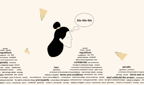
But it’s the law!
Yes, there might be a law out there that can be interpreted in a way that we have to add an A4 disclaimer in the footer of every screen or ask consent to ask consent.
It also might be interpreted differently. The regulations (usually) don’t state the exact text and the exact spot on the screen where this text has to be.
We might think that we are open and friendly if we put all the juridical stuff into plain sight in every step, but unfortunately, that’s not true. Because in every juridical text the message is hidden in the sea of letters. The lawyers see the message, but the users read just bla-bla-bla.
Nobody reads the terms and conditions, disclaimers or consents. At best they are looked at for a couple of seconds. They are roadblocks that stand between your service and the customer. The users just sigh and climb over or turn around and leave.
Of course, we must be compliant, but there are ways to be without rolling the burden on the user.
But that is your job to make it simple
Whenever there are no more solid arguments, the designers get to hear the classics — “but that is your job to make it simple”.
Part of me, of course, is flattered that you think of design as a magic wand that can heal all the ailments of a complex product or service by not changing anything major — just some placement of buttons and a new font perhaps?
I do agree that with the design you can do some magical stuff or else I wouldn’t be a designer. But the design must start from the core. If you hand us over a finished product with 400 features that “just needs some colour and a new logo” then this is exactly what you get. Your complex product with some colour and a new logo. It won’t get any simpler or easier to use. Design can’t do magic if the “product lawyers” let us see the product only from afar and spray paint on it through the bars.

Just one more thing
This is such a small thing, surely we can add that. Whom will it hurt? Nobody can be that stupid not to understand that.
Pssst! You’re talking about your own customers here. And yes they can. Yes, we can. The thing is — the users have their lives and context, they use your product in the midst of daily joys and dramas and they don’t pay much attention. Why should they — it is just a stupid banking app/ticket machine/enter your service here. It is supposed to make their life easier, not make them think (surely we all know that at least since 2000).
Complexity rarely takes the form of one inseparable monster-feature. Usually, it consists of many small details that separately are all simple and useful and even cool, but put them all together (and add just one more link to the lot) — and boom!
The pure evil complexity monster is born right before your very eyes.
To be able to become and stay simple, you must be aware of the lurking danger of complexity. Hopefully the article helped to pinpoint the issues that we as the designers constantly face. It’s a fight we cannot win alone but we can win together.
Illustrations by Merilin Mändmaa