Consumer lending is often associated with anonymous lenders and minimal personal interaction. People approach loans with caution because it's rarely clear who is actually on the other side of the table, or whether their best interests are being considered. Modena wanted to change that perception and become a genuine financial partner, not just another lender focused on profit.

The process started with customer research. Interviews with private and business customers helped identify what builds trust and what it takes to become a reliable financial partner. Two workshops with Modena's internal team ensured the brand would be built from the inside out.
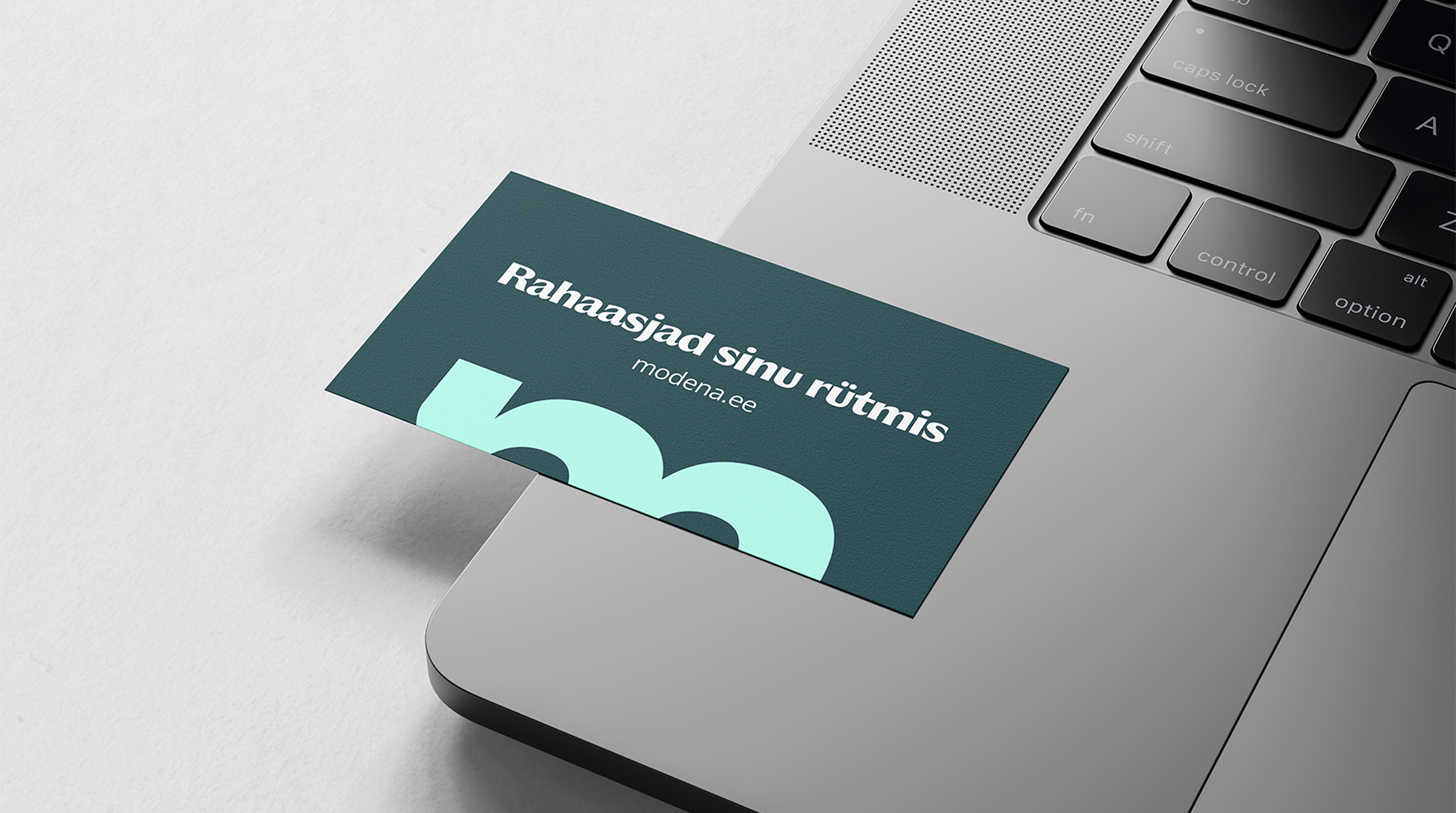
Two key insights came out of the research. First, customers want to know who they are actually dealing with. That led to the "Facing the Customer" concept. Modena's team is publicly visible across digital and social channels, with names, photos, and contact details. They don't just represent Modena, they are Modena. Second, customers need to feel their loan provider is available when life gets hectic. That insight led to the slogan "Finances at Your Rhythm", reflecting Modena's commitment to moving at the customer's pace. Money should never become a barrier when there is a desire to bring an idea to life.
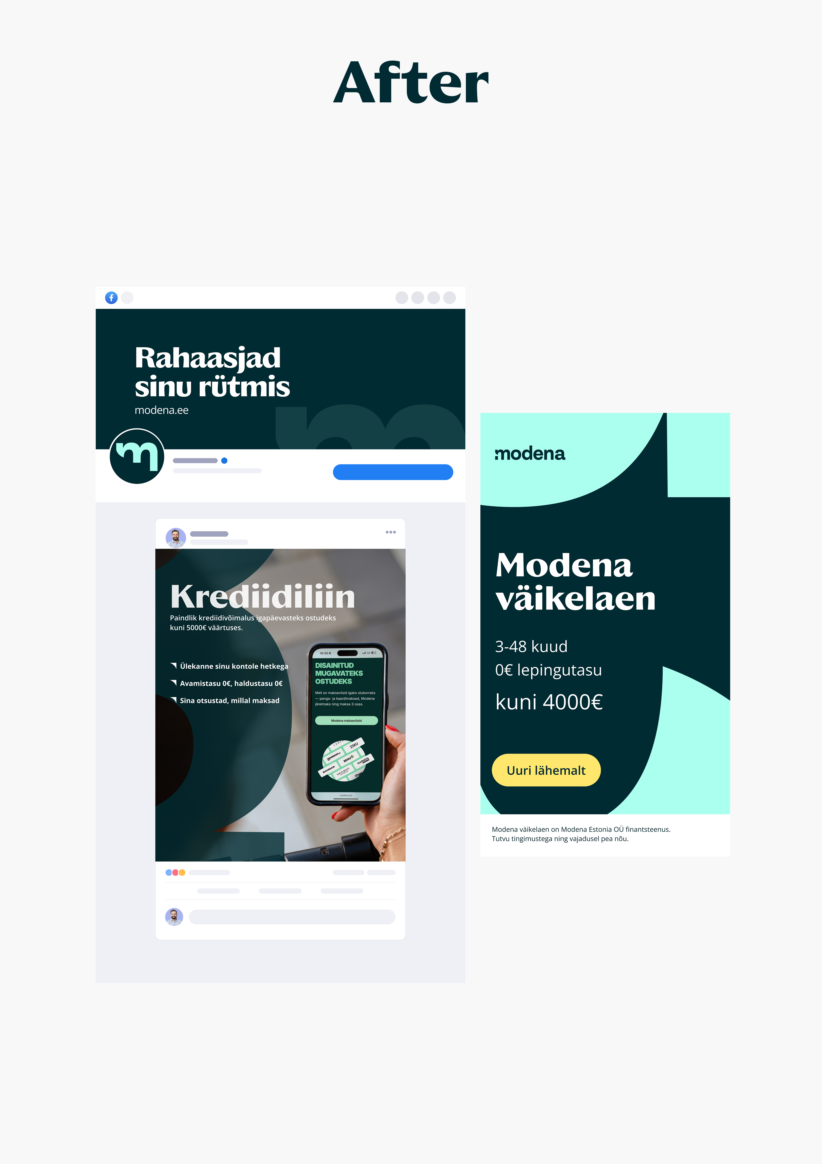
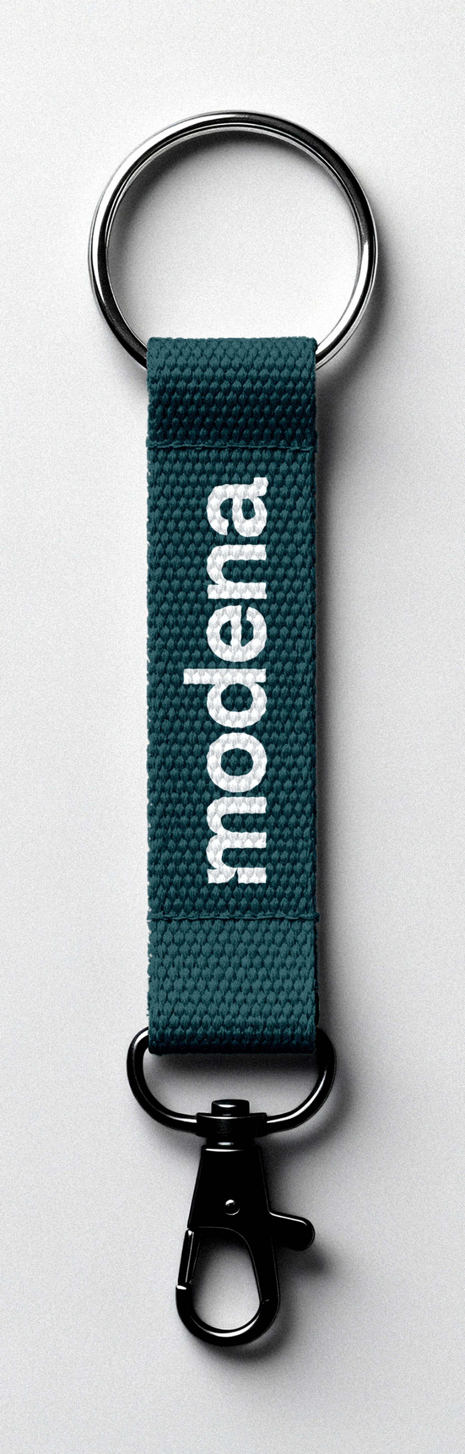
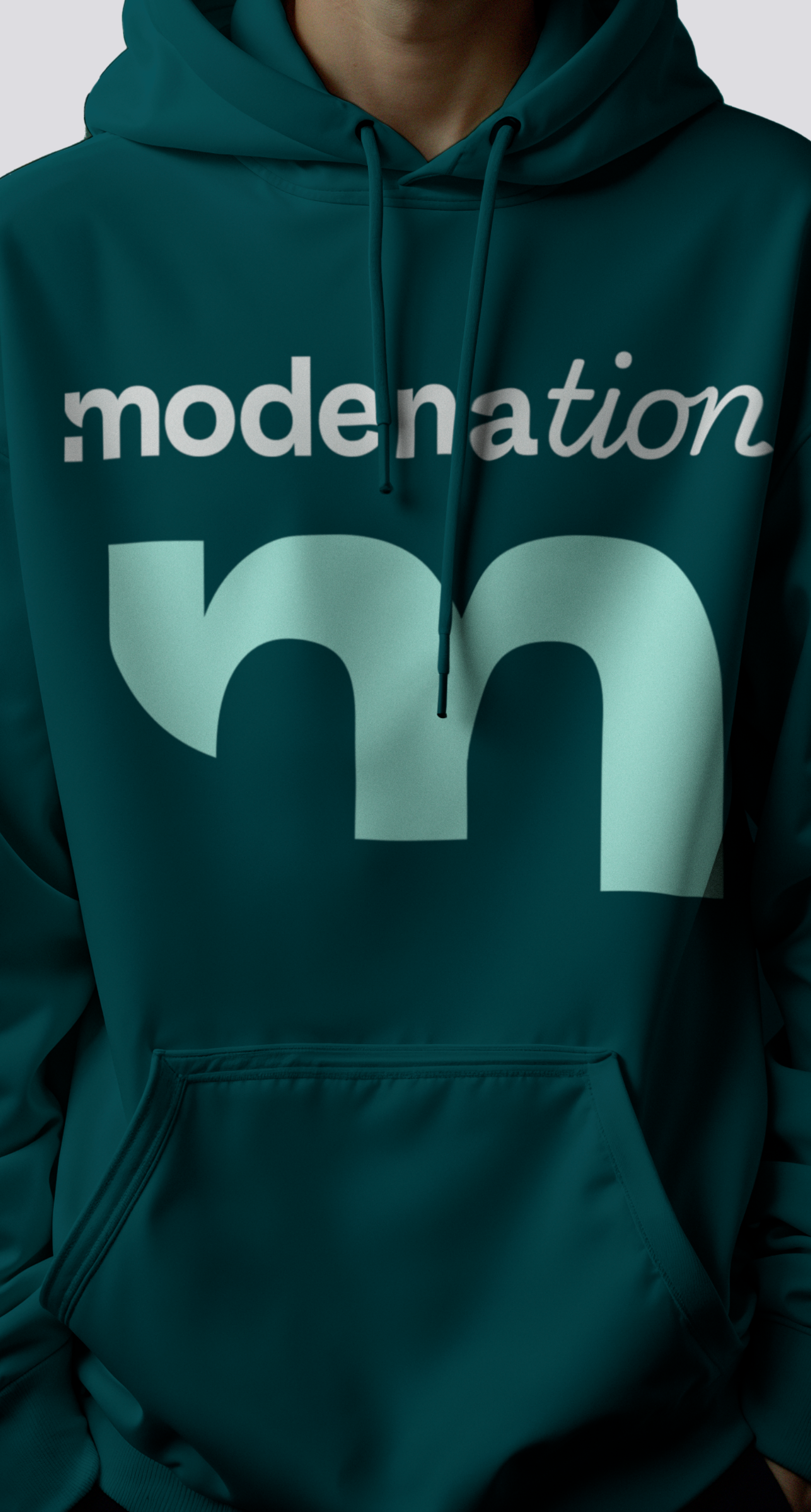
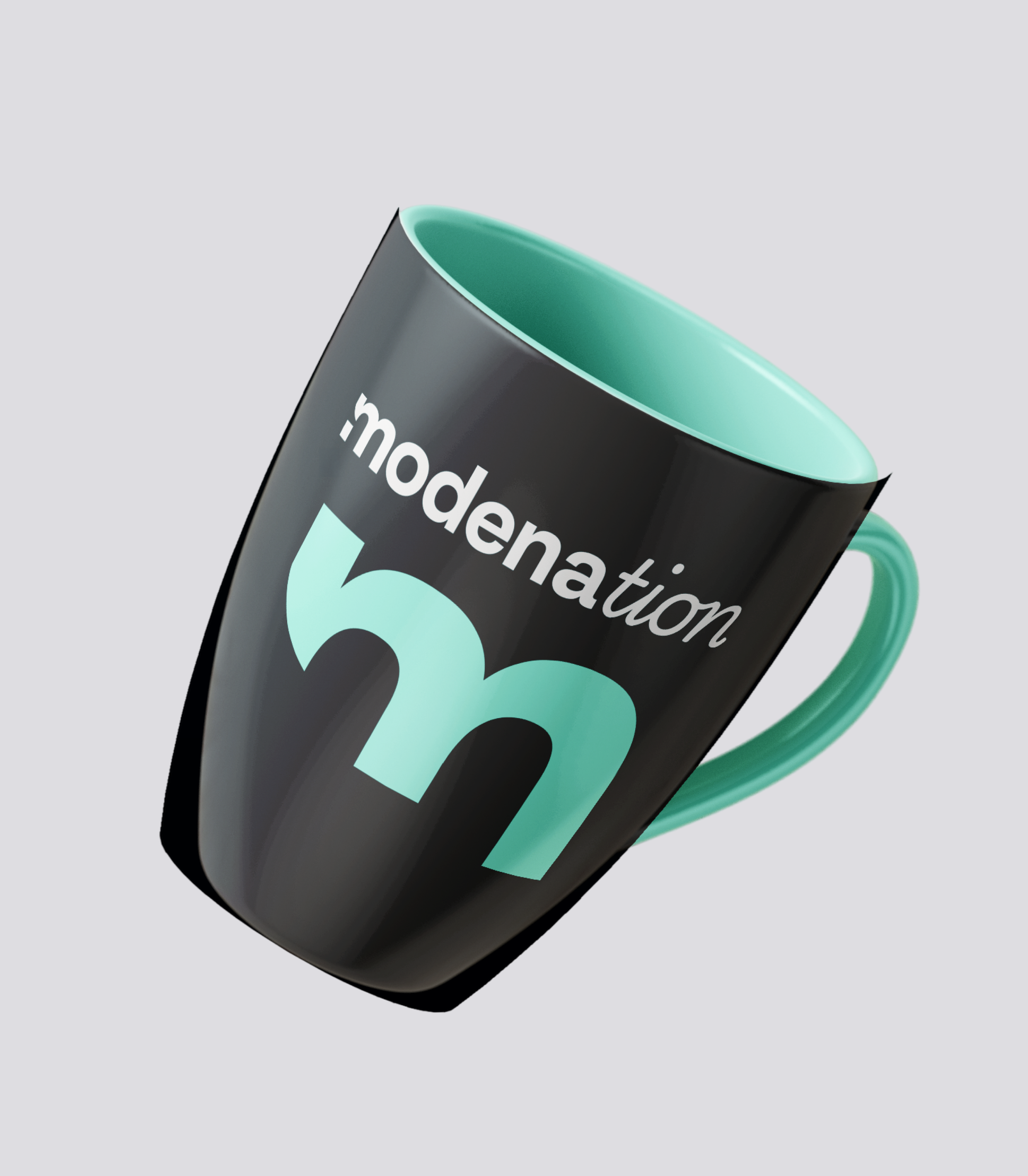
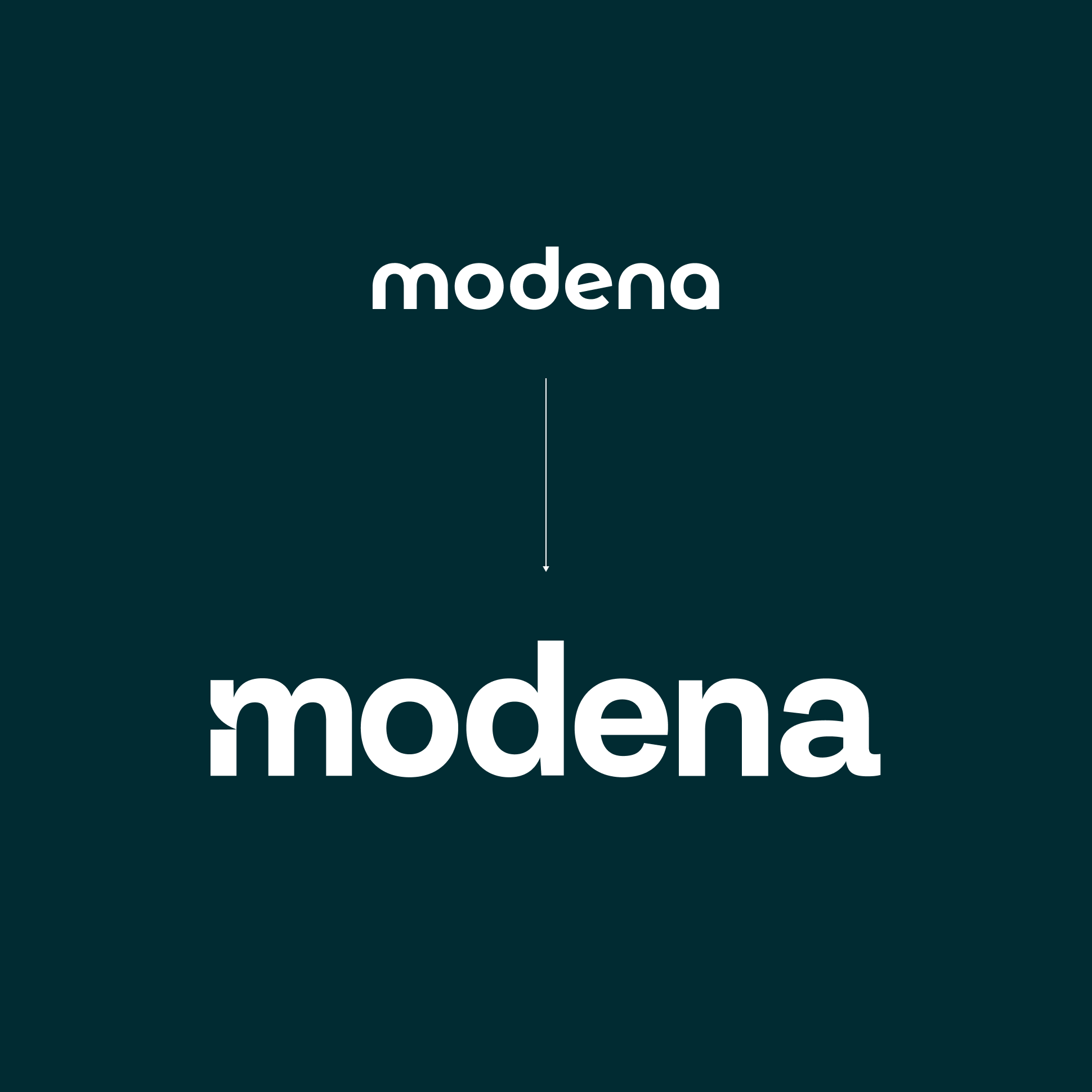
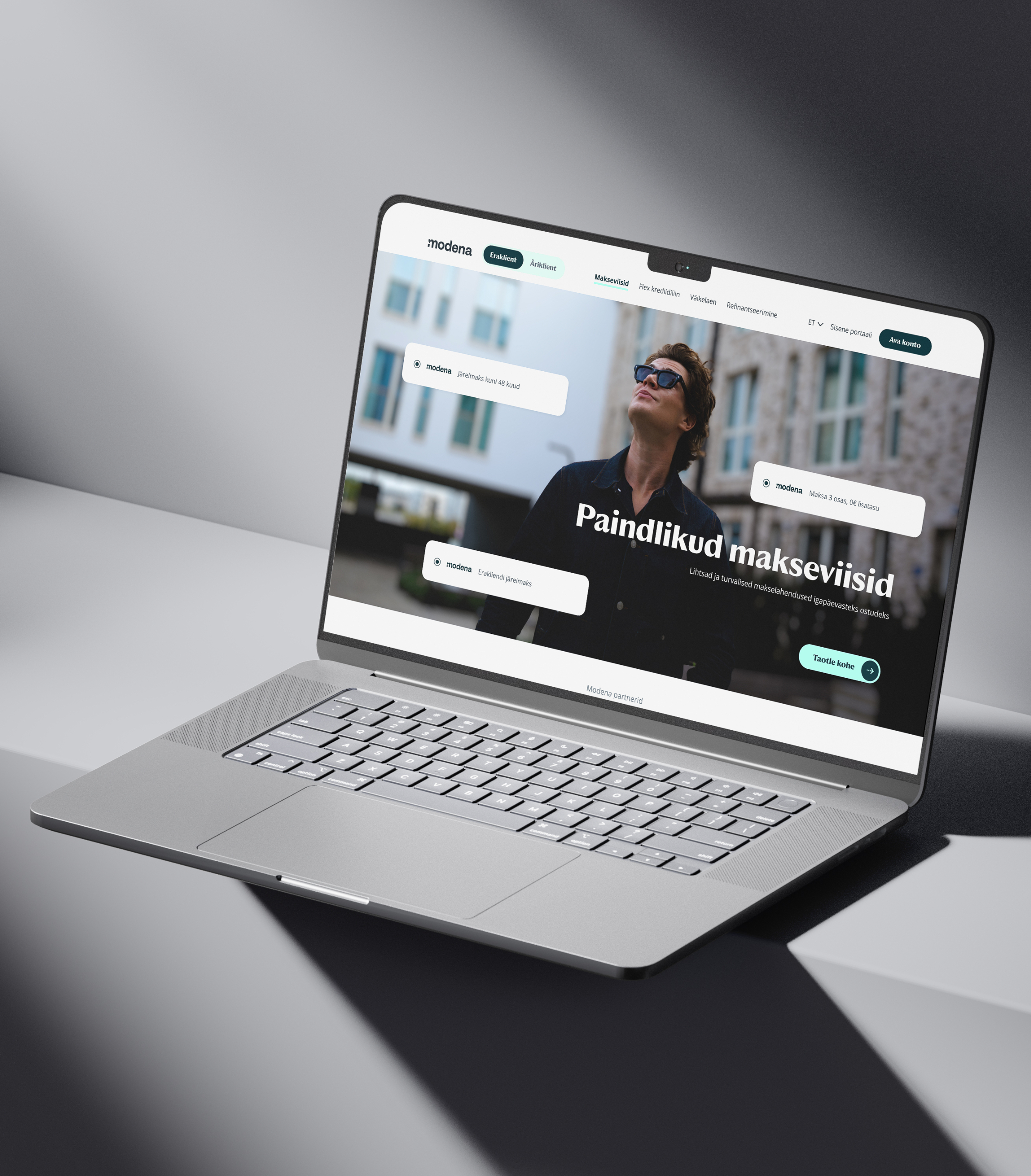
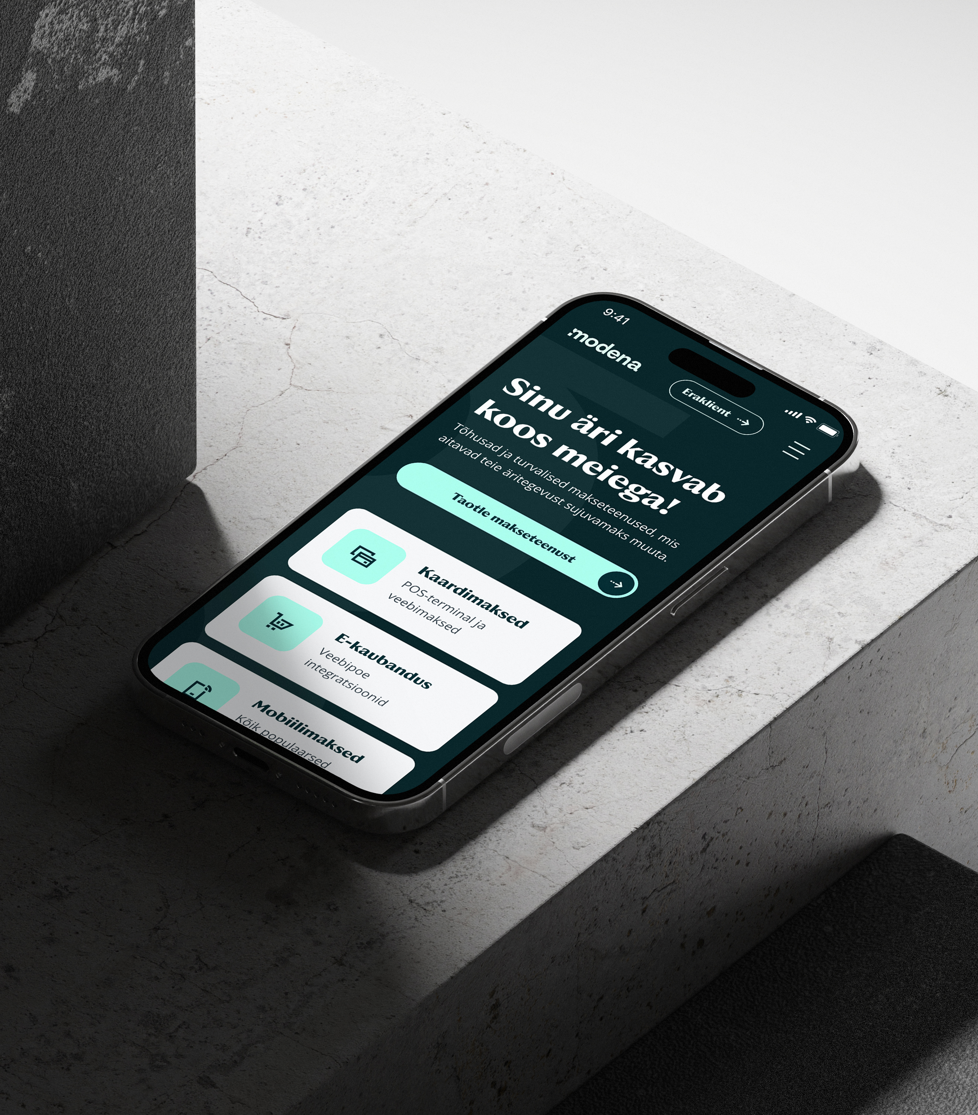
The new visual identity kept familiar elements while making the overall look more professional. The mint green from the old brand was developed into a deeper green palette, with a yellow accent for CTAs. The font was replaced with one with sharper edges. A small cut through the letter "M" adds character to the logo. A new brand element based on the letter M uses flowing curves to visually reflect the rhythm concept. Photography features Modena's own people and real models, with no stock imagery, to build trust through authenticity.


Working with Rethink helped us take a clear step forward as a brand. Elina and Anna's strategic approach helped create a distinctive, professional, and customer-centered brand identity that works consistently across our messaging, visuals, and everyday marketing. As a result, Modena now has a clear and recognizable brand that our team truly believes in and that supports our credibility and growth.Chris Kiidemaa; Turundusjuht